Bar Graph II - 막대그래프
막대그래프를 그리는 방법을 살펴보기 위해서 R에 내장되어 있는 mtcars 파일을 사용하였다.
mtcars 파일을 좀 살펴보면...
str(mtcars)

'data.frame':	32 obs. of  11 variables:
 $ mpg : num  21 21 22.8 21.4 18.7 18.1 14.3 24.4 22.8 19.2 ...
 $ cyl : num  6 6 4 6 8 6 8 4 4 6 ...
 $ disp: num  160 160 108 258 360 ...
 $ hp  : num  110 110 93 110 175 105 245 62 95 123 ...
 $ drat: num  3.9 3.9 3.85 3.08 3.15 2.76 3.21 3.69 3.92 3.92 ...
 $ wt  : num  2.62 2.88 2.32 3.21 3.44 ...
 $ qsec: num  16.5 17 18.6 19.4 17 ...
 $ vs  : num  0 0 1 1 0 1 0 1 1 1 ...
 $ am  : num  1 1 1 0 0 0 0 0 0 0 ...
 $ gear: num  4 4 4 3 3 3 3 4 4 4 ...
 $ carb: num  4 4 1 1 2 1 4 2 2 4 ...
여러 변수 들 중, cyl 변수와 gear 변수를 토대로 막대그래프를 그려보았다. 이 전에 cly 변수와 gear 변수의 빈도표를 살펴보았다.
car_cyl <- table(mtcars$cyl)
car_cyl

4  6  8
11  7 14

table(mtcars$gear)

 3  4  5
15 12  5
mtcars$cyl을 car_cyl에 할당하였고, car_cyl의 가장 기초적인 막대그래프를 그려보았다.
barplot(car_cyl, main= "cylinder types of cars",
        xlab = "number of cylinder")
main에는 그래프의 제목을, xlab에는 가로축에 나타낼 제목을 적어주면 된다. 그 결과..

만약 각각의 막대그래프에 색을 넣어주고 싶다면 col = c(" 색", "색", "색")을 넣어주면 된다.
barplot(car_cyl, main= "cylinder types of cars",
        xlab = "number of cylinder",
        col = c("light blue", "light green", "grey"))
y 축에도 제목을 넣어주고 싶다면 ylab = " " 을 추가해주면 된다.
barplot(car_cyl, main= "cylinder types of cars",
        xlab = "number of cylinder",
        ylab = "frequency",
        col = c("light blue", "light green", "grey"))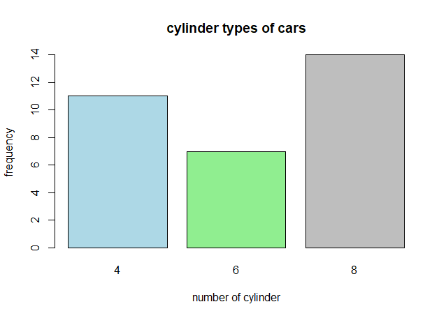
가로축에 4,6,8 은 데이터에 있는 값을 가져온 것인데 이것 대신에 이름을 할당할 수 있다. names.arg를 사용하면 된다. 그리고 코드에 보면 horiz=FALSE라고 되어 있는데 그래프를 수평으로 놓을 것인지에 대한 설정이다.
barplot(car_cyl, main= "cylinder types of cars", horiz = FALSE,
        names.arg = c("4 cylinder", "6cylinder", "8cylinder"),
        col = c("Sky Blue1" , "Light Pink1" , "Pale Green1"),
        xlab = "cylinder types",
        ylab = "Frequency")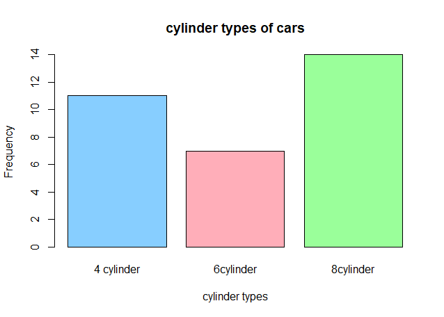
그래프를 수평으로 놓고 싶다면 horiz = TRUE로 설정하면 되고 xlab과 ylab의 값을 바꿔주면 된다.
barplot(car_cyl, main= "cylinder types of cars", horiz = TRUE,
        names.arg = c("4 cylinder", "6cylinder", "8cylinder"),
        col = c("Sky Blue1" , "Light Pink1" , "Pale Green1"),
        xlab = "Frequencies",
        ylab = "Cylinder types")
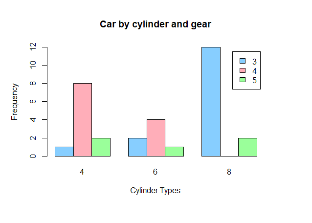
지금까지는 한개의 변수만을 이용해서 막대그래프를 그렸다면, 이제는 두개의 변수(gear와 cyl)를 이용하여 막대그래프를 그려보았다. 행의 값 3,4,5가 gear 변수의 값이고, 열의 4,6,8이 cylinder의 값이다.
car_cyl_gear <- table(mtcars$gear, mtcars$cyl)
car_cyl_gear

     4  6  8
  3  1  2 12
  4  8  4  0
  5  2  1  2
legend의 위치는 조정이 필요하지만 일단, 각각의 그래프는 cylinder type을 나타내고 그 안에 gear의 분포를 보여주고 있다.
barplot(car_cyl_gear, main="Car by cylinder and gear",
        xlab="Cylinder Types",
        ylab="Frequency",
        col=c("Sky Blue1" , "Light Pink1" , "Pale Green1"),
        legend = rownames(car_cyl_gear))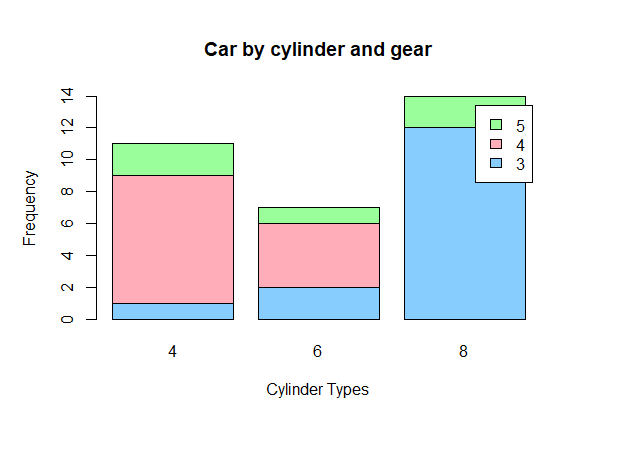
cylinder type 별, gear의 종류에 따른 막대그래프를 그리기 위해 beside=TRUE를 추가해주면 된다.
barplot(car_cyl_gear, main="Car by cylinder and gear",
        xlab="Cylinder Types",
        ylab="Frequency",
        col=c("Sky Blue1" , "Light Pink1" , "Pale Green1"),
        legend = rownames(car_cyl_gear), beside=TRUE)