-
scatter plot - 산점도 그래프R/Contents 2023. 10. 22. 09:44
ggplot2 패키지를 이용해서 scatter plot을 그려보았다.
ggplot2 패키지가 설치되어 있지 않다면 먼저 설치하고, 로드해야 한다.
install.packages("ggplot2")
library(ggplot2)
ggplot2 패키지 안에 있는 데이터 "mtcars" 를 사용하였는다.
head(mtcars)

                   mpg cyl disp  hp drat    wt  qsec vs am gear carb
Mazda RX4         21.0   6  160 110 3.90 2.620 16.46  0  1    4    4
Mazda RX4 Wag     21.0   6  160 110 3.90 2.875 17.02  0  1    4    4
Datsun 710        22.8   4  108  93 3.85 2.320 18.61  1  1    4    1
Hornet 4 Drive    21.4   6  258 110 3.08 3.215 19.44  1  0    3    1
Hornet Sportabout 18.7   8  360 175 3.15 3.440 17.02  0  0    3    2
Valiant           18.1   6  225 105 2.76 3.460 20.22  1  0    3    1
ggplot을 이용해서 산점도를 그리기 위해서는
full version
ggplot(data = 데이터명, aes(x=x축 변수, y=y축 변수)) + geom_point(x=x축 변수, y=y축 변수)

short version
ggplot(데이터명, aes(x축 변수, y축 변수)) + geom_point()
mtcars 데이터를 이용해서 그려보면,
ggplot(data=mtcars, aes(x=wt, y=mpg)) + geom_point(x=wt, y=mpg)

ggplot(mtcars, aes(wt,mpg)) + geom_point()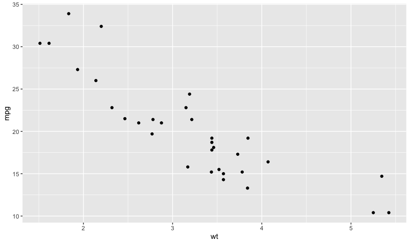
[그림 1] scatter plot 만약 색상을 바꾸고, 각 표시된 점들의 크기를 바꾸고 싶다면, geom_point()안에 colour="색상"과 size = 숫자 를 넣어주면 된다.
ggplot(mtcars, aes(wt,mpg)) + geom_point(colour="blue", size = 4)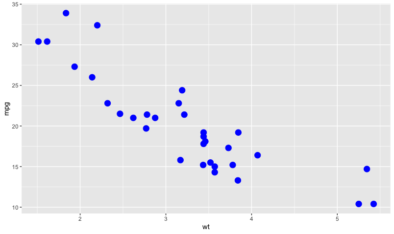
[그림 2] scatter plot 색상 추가 및 크기 조정 만약, 실린더 변수의 값에 따라 색상을 달리하고, gear 변수에 따라 사이즈를 다르게 하고 싶다면,
ggplot(mtcars, aes(wt, mpg)) + geom_point(aes(colour = cyl, size = gear))
[그림 3] scatter plot 3 위의 그래프에 선형회귀선을 그리고자 한다면 geom_abline()을 추가하면 되는데 자세히 살펴보았다. 이를 위해 먼저 절편값과 기울기 값을 구해보았다.
mtcars_coefs <- coef(lm(mpg ~ wt, mtcars))
mtcars_coefs

(Intercept)          wt
  37.285126   -5.344472
geom_abline()을 추가해 보았다.
ggplot(mtcars, aes(wt, mpg)) +
  geom_point(aes(colour = cyl, size = gear)) +
  geom_abline(intercept=mtcars_coefs["(Intercept)"],
              slope = mtcars_coefs["wt"], colour = "red")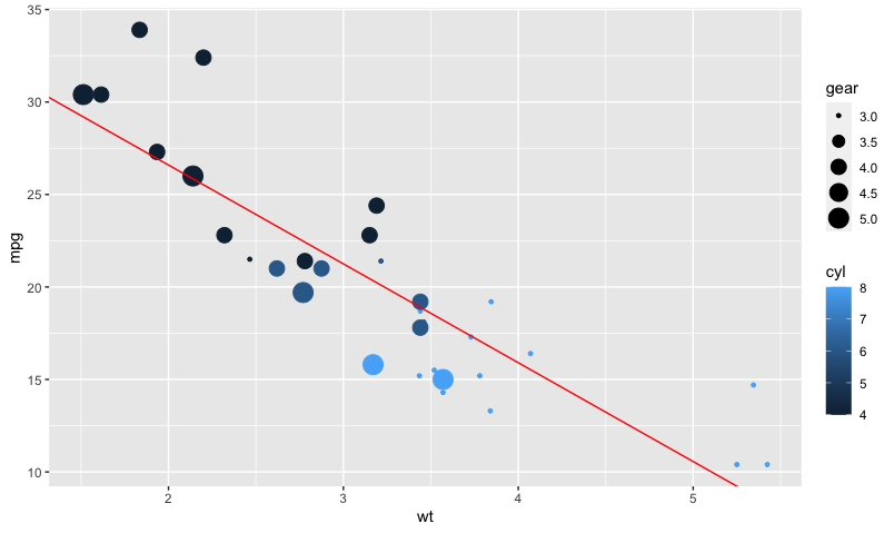
[그림 4] scatter plot 에 회귀선 추가하기 geom_point()를 다르게 해서 그려보았다.
ggplot(mtcars, aes(wt, mpg)) +
  geom_point() +
  geom_abline(intercept=mtcars_coefs["(Intercept)"],
              slope = mtcars_coefs["wt"], colour = "red")
[그림 5] scatter plot 회귀선 추가 2 회귀선을 추가하는 다른 방법은 다음과 같다. geom_abline 대신에 stat_smooth(method = , se = , colour = )를 추가하면 된다.
ggplot(mtcars, aes(wt, mpg)) +
  geom_point() +
  stat_smooth(method = "lm", se=FALSE, colour="red")
[그림 6] scatter plot 회귀선 추가 (stat_smooth) 'R > Contents' 카테고리의 다른 글
수열생성(벡터생성) (0) 2022.04.17 R에서 특정 변수(혹은 특정 열)만 선택하기 (0) 2022.02.09 [R] 변수명 변경하기 (0) 2021.10.18 R 설치하기 (0) 2021.06.12 R에서 새로운 컬럼 혹은 변수 생성하고 값 부여하기 II (0) 2020.05.16